 Logo design trends have considerably changed during the past decade. Some modifications were memorable, while others were borderline unsuccessful.
Experts often advise designers to avoid following ongoing movements, but keeping up with the latest trends is always a good idea. It helps businesses create relevant logos that are appealing to their potential customers.
However, it can be tricky for designers to keep up with all the changes. After all, every year comes with its own style and fashion. I have decided to help my fellow marketers by putting together a list of logo design trends for 2023 to watch out for.
Logo Designs to Consider in 2023
Glitch Effect
This is a trend that designers need to follow closely. The glitch is known to add appeal and make logos look more futuristic. It’s also known to grab the attention of younger consumers.
Logos featuring the glitch effect are reputed for working well with eCommerce websites and apps and entertainment, music, and advertising companies. Many specialists believe the trend will continue well beyond 2023 as it enables organisations to create easy-to-recognise logos that raise brand awareness.
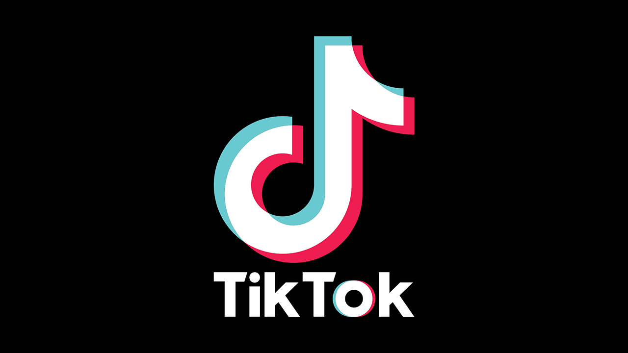
TikTok’s logo is arguably the finest example of the glitch effect. It has allowed the app to gain global recognition and is currently one of the most distinguishable logos in the world.
Typography With a Twist
Another trend that is likely to remain relevant beyond 2023. Objects, waves, and lines are widely seen in logos across different industries. This technique can also make brands appear timeless, modern, and creative.
Media, fashion, and technology companies use such logos to communicate their values to customers. On the other hand, startups use it to raise recognition and awareness of their business, as people are more inclined to remember company names in creative text styles.
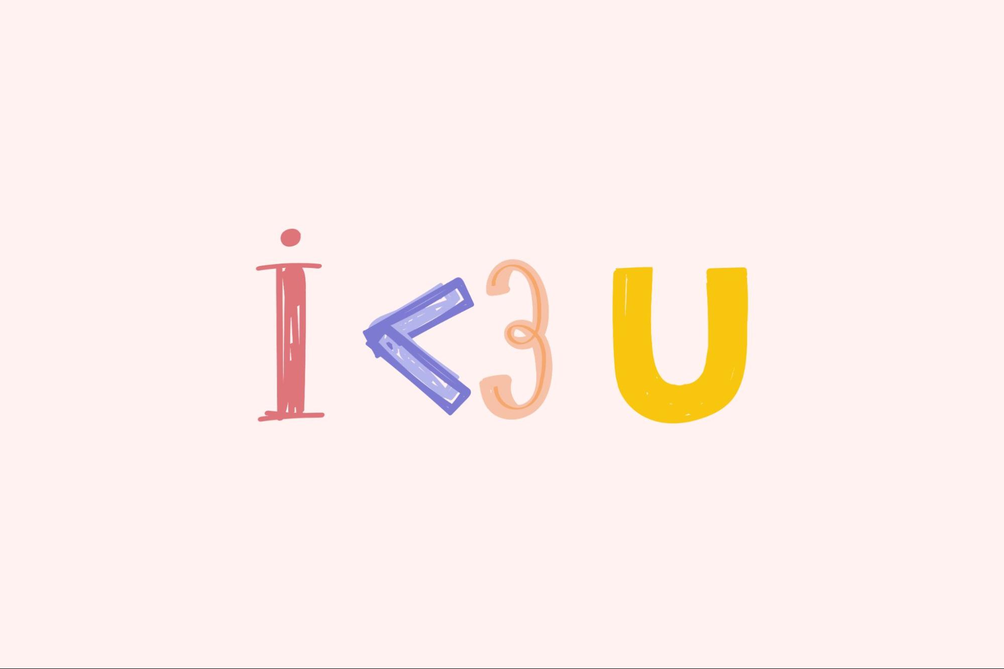
Whether the logo is monochrome or multicoloured, its wordmark or initials will stay engraved in memory for a long time. Many experts believe this technique will remain dominant for several years.
Negative Space
Negative space is a straightforward design method that allows businesses to create an effect which captures clients’ attention. The concept behind the technique is simple – it uses blank spaces within or around logos to define their silhouette.
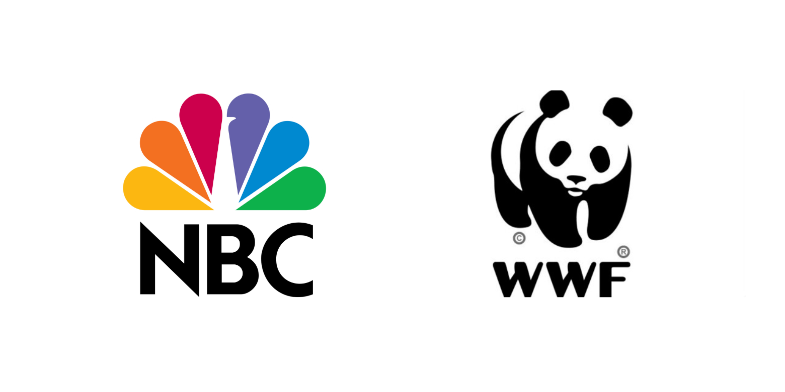 Both small and large companies use negative space for their brand marketing. The NBC logo is arguably the most famous example. It depicts a hidden peacock fanning its colourful feathers. Another great example is the WWF logo. Here designers used blank spaces to create a panda.
Ornamental Monograms
Also known as letter marks, this type of logo features a single decorative symbol consisting of one to three letters.
In the past, monograms were perceived as institutional logos. However, nowadays, more and more businesses are opting for them. Designers have taken this classic design to a new level by giving it an ornamental spin, which consists of additional layers, typefaces, and contrasting colours.
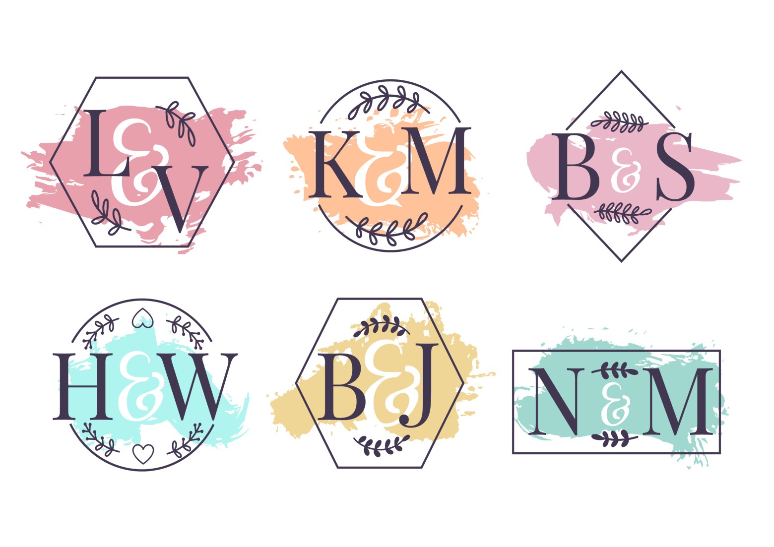
Ornamental monograms are expressive logos that effectively transmit a brand’s values and mission. After all, it’s no fluke they have passed the test of time. Furthermore, they are perfect for email signatures.
Ultrathin Lines
Minimalist designs featuring thin lines have been around since 2020. But ultrathin lines are more or less new to the scene. They are adjustable to any concept, brand, or business and give logos a sophisticated pencil-drawn appearance.
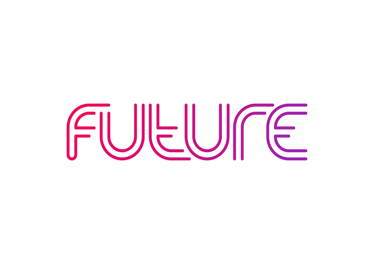
Designs with ultrathin lines can be combined with bright elements and gradient backgrounds to give logos extra pizzazz. More and more companies are following this trend, which delivers splendid results. It’s also a technique that allows designers to swiftly make changes if a logo isn’t up to par with expectations.
Distorted Geometry
Logo creators have been using geometric shapes for ages. Smooth, calculated, and precise, they offer a solid contrast to the biomorphic silhouettes, we see in nature. In recent years, designers have decided to clap back at known mathematical rules to make distorted geometry logos that are, mildly said, eye-catching and stylish.
By tugging, twisting, and breaking geometric figures out of place, logo makers challenge the subtle character of predictable geometry. They are setting a new standard by constantly changing norms.
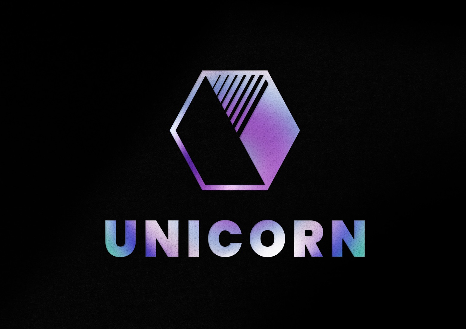
Each logo design in this trend displays jagged edges, shard contours, and missing pieces. Often coloured in neon or chrome tones, they are slick and defiant in grabbing the audience’s attention.
Modern Art Deco
Popular from the 1910s to the 1930s, art deco is making a comeback. As with any revival, designers update their work to the latest trends. Meaning they are including art deco elements in logos.
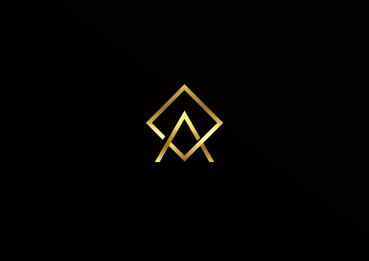
Juxtaposing styles from the 20th and 21st centuries allows logo creators to create unique designs that send the right message to audiences. Modernising and revitalising the art deco movement for today’s context offers vast unexplored possibilities, which companies and designers will exploit far beyond 2023.
Have Your Logo Design Made by Professionals
These are some of the most noticeable logo design trends for 2023. If you want to start a new business or rebrand your company, get started on the design right now. Try different techniques to pick a logo that best represents your values, mission, and message. Contact D&D Marketing if you need assistance. We’re always happy to put our creativity at your service.


